One of the most demanding jobs is to retouch portrait pictures to put them on the cover of some magazines or into them. In this series I will explain you my for sure not perfect or special way of retouching an image. Most of my knowledge is selfdeveloped and some parts are taken from various and uncountable tutorials. I will show you the whole production from the start to the end and try to leave nothing unclear.
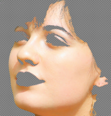
At first need an image with a satisfying resolution. It should be sharp and bright enough to have some room for adjustments. If it is to dark you might get some color artifacts while editing some parts of the image. The following one could be an example. I will use this pic during the whole series.

I always start with some roughly done skin clean ups. So we use the heal-tool to remove some dots on the skin without leaving any noticeable traces. I recommend to do this step very accurate since we want to achieve a very smooth impression on the skin. The heal-tool is rather easy to use. Klick onto a clean spot on the skin while holding down Ctrl and then simply click on the dots.
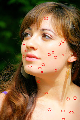
The heal tool always gathers information around the brush how the color of the image is there and averages them where you paint. So if you want to overpaint a dot that is located near a border to a very dark part of the image you might paint much darker than the skin should be at this spot. If this occurs just use the stamp tool in this case. So i rename the "Background" layer to "Original" and get started. After the clean up of the skin it should look similar to this:
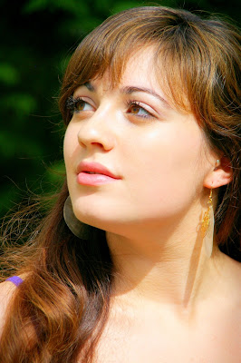
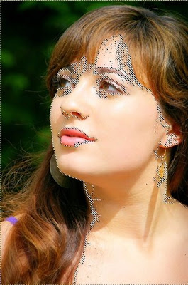
Now you should magnify the view and redo the step before with some smaller spots. afterswards you should have a much smoother impression of the skin. Now we will start to divide the pic up into different parts. We will create two layers that contain the skin. Two for idfferent parts of the eyes and some more. Let's start with the skin. In this pic I would recommend to use the "Fuzzy Selection Tool" to make a selection that contains the skin. If you are finished it should like similar to this:
Go to "Select" -> "Save to channel" to store the selection. Maybe we will be needing it again. Now duplicate the "Original" Layer and rename it to "Skin #1" and add a layermask from the selection to it. Do this via "Layer" -> "Mask" -> "Add Layer Mask". There you should select "Selection" and "Add". Make the "Original" Layer invisible to get a clue what we actully have in our "Skin" layer. Moreover I marked some critical spots which might be needing some manual work:
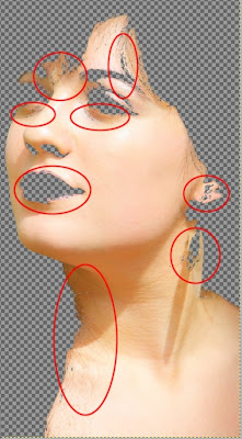
Select the layermask we just created, and the two colors we need now are black and white to edit the layermask. Most important issue is the hair. You should avaiod that the skin-layer contains any hair. or you just overpaint the hair it contains. We are going to blur the skin layers very much and blurred hair looks like crap. Then you should take care of some holes in the mask for example below the eyes and above the right eye brow. The face should be fine when the skin layer contains the following parts of the image:
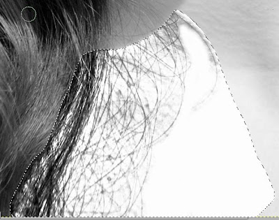
The part near the throat with the scattered hair will need some tricks to get rid of it. We will duplicate the "Original" layer and desaturate it via: "Colors" -> "Desaturate" -> "Luminosity". Now we create a rough selection with the "Free Select Tool":
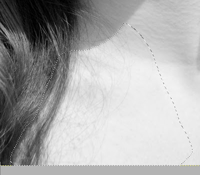
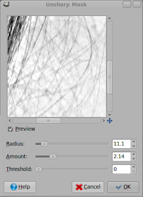
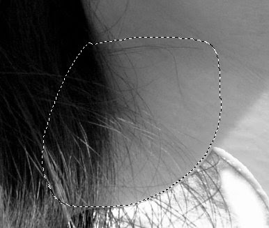
What we need to get now is that in this part of the image we make all the scattered hair black and all the rest white since we want to integrate this into our layermask later on. The curves tool might be a great help in this case. But first feather the selection at about 10px via: "Select" -> "Feather..." and apply the "Unsharp Mask" filter to our selection that can be found at: "Filters" -> "Enhance". Use some similar settings to those:
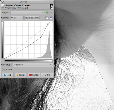
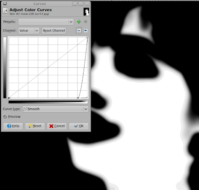
Now open up the curves dialog via: "Colors" -> "Curves". You need to fiddle around a bit with them but I could come up with the following:
Still we have got to overpaint the rough parts of the skin to make them pure white:
Now press Ctrl + C, select the layermask of the skin, paste it into this and make our greyscale layer invisible. Now press Ctrl + H to merga the pasted layer and the layermask. Now we need to repeat this procedure with the following section:
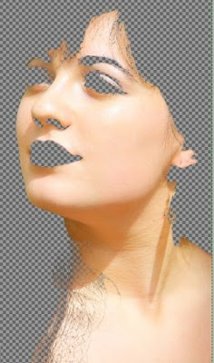
You might need some different settings for the steps to end up in a good result but I will leave this up to you. Our skin-layer might look something like this:
Duplicate the skin layer and blur this layermask with gaussian blur about 90 pixels. To watch your result rightklick on the layer in the layer list and select "Show Layer Mask":
Use the Curves Tool to edit the mask as follows:
Now blur the Mask again but just with 30px radius.
Now we can treat the parts at the edges of the skin differently than the rest. We will need that later on.
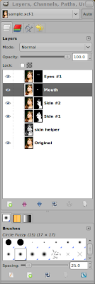
The next steps will be rather easy. We are going to make some sepperate layers for the eyes, the mouth and the hair. This can easily done by duplicating the "Original" layer, giving it a meaningful name and then painting manually into the layermask. The method fits for the mouth and the rough layer for the eyes. After you have done this your layers could look like this:
What might come helpful as a trick is when you paint the layermask you should first create a black one then invert the colors of the actual layer, then switch back to the layermask and paint with white or gray and you will se clearly where your layermask is white while you can still look at the image and see where you paint.
Now we are finished with the first part. Try to get really into it and try to understand it completely until we hit the
next chapter.


