Showing posts with label effect. Show all posts

Speed effects for photos

Do you know this situation? You just shot a really nice pic and you don't really see any reason why you should retouch it and just want to make it look even cooler without spending hours of work. So here I will come up with some VERY quick methods to make some pics look neat. As always it depends on the actual image and your taste which one fits to your shot or even if any. I will show all of them with the same pic so that you can clearly distinguish the different effects these methods have on the images. The shot was taken by Cara Gutman. The different methods must be done independently. So with every new point you should start with a vanilla image.


1. Duplicate the image layer twice, select the top one, increase its brightness by 60, desaturate it(luminosity) and set its layermode to screen. Select the middle layer, increase its contrast by 60 and set its layer mode to value:


2. Duplicate the image layer, add an layer mask that contains a greyscale copy of the layer itself and duplicate the layer with the mask again. Set the top layer's mode to screen and the middle one to multiply and invert this ones layer masks colors. Increase this mask's contrast by 100. Now select the other layer mask and increase brightness by 30 and contrast by 80. Finally apply "Filter" -> "Noise" -> "RGB Noise" with "correlated Noise" activated and an amount of 0.35 to the layer mask of the "screen" layer:


3. Duplicate the image layer, add an layer mask that contains a greyscale copy of the layer itself. Now increase tha masks contrast by 40 and colorize the layer with the settings you want. You have got to fiddle a bit around to find some fitting settings:

That's it for now. Thanks for reading this very little guide.

Creating a dirty and cool background

You might have seen them on some music covers or concert posters. Often they have got a very grungy and dirty background that looks soooo cool. Often you can't distinguish the different parts of the images because they are somehow composed together very good and only by looking at it very closely you see the components of the background. I will try to show you some techniques how to achieve an effect like that:


Therefore we need some material to start with since we won't start from scratch. You can find a very huge amount of photos on CGtextures.com. I picked the following ones as an example. I recommend you to always download the biggest format available but in this guide I used the medium sizes to be able to get some more material since it isn't for print anyway. The free 15MB/day are more than enough to start with. So these are the pics I chose from CGTexures.com: (again these are not my photos and copyright is at their website.)
mat1
mat2
mat3(image1)
mat4(large)
mat5(large)
mat6(large)
mat7

Now we can open up a blank image at the size of 1200x1600 and open our whole material as layers via "File" -> "Open As Layers". In this dialog you should be able to select more than one image and they will be loaded at once one after another. Now make all layers invisible except the one you want to have as the background layer. Move this one to the bottom and duplicate it:

Move one of the two upwards until its top edge touches the upper edge of the image. But this looks rather crappy because the lower part of the moved up layer creates a very hard edge. So wee need a layermask to hide this part of the layer. But first duplicate the upper layer again and make the duplicate invisible. We will be needing this one later on. Now create the layermask and select the gradient tool. Choose the colors black and white and apply a linear gradient to the layermask that it looks as follows:

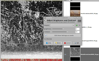
But still the blending does not look really good. Now we need our invisible and duplicated layer. Make it visible, desaturate it(Luminosity) and boost the contrast a bit, that the scratches get out even clearer.

Select the gradient tool, set its mode to Multiply and apply a cradient that the layer looks as follows:

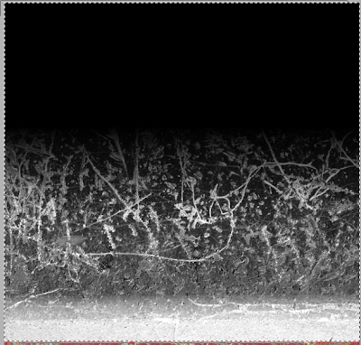
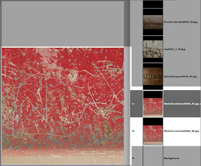
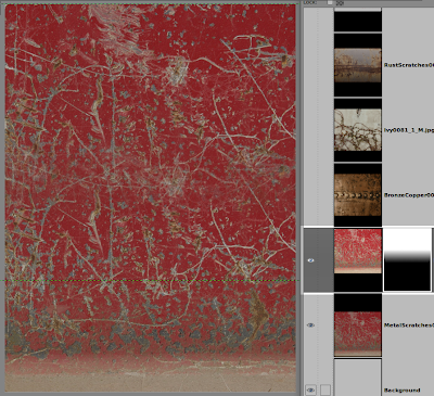
Press "Ctrl" + "A", "Ctrl" + "C", select the layer mask and hit "Ctrl" + "V" and set the "Floating Selections" mode to "Substract". Now you can anchor the Floating Selection via rightclicking on it and selecting the entry. When you look at the layermask you see that the gradient now also contains some scratches from the layer and the blending doesn't look that smooth anymore. You can delete the greyscale layer if you want but you dont have to. Just make it invisible. Make sure that only the background is visible and create a new layer containing this background via rightclicking and selecting "New from visible". Now rename this layer to background and make all the others invisible.

Lets move on to the next component. Select the layer that contains the splatter, rotate it 90 degrees and size it up proportionally until the width is about 850px. Apply a layermask with the greyscale copy of the layer and invert the layermask:

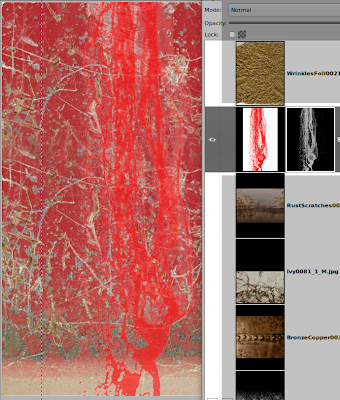
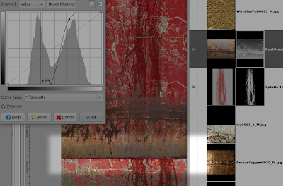
Use the curves tool on the layermask to tweak the mask your needs. Now select as layer mode "Multiply" and use the "Hue-Saturation" dialog to lower the saturation a bit and the lightness pretty much until you can clearly see the splatter.

For now we can put in the next part and you should select the "RustScratches0003..." layer and move it above our splatter if it isn't yet. Again we should use basicly the same method to blend the layer into the rest of the image. We create a layermask that contains the greyscaleversion of the layer, invert is and tweak its tones. But this layer has got the bad property that the lower part of the layer has got the same value as the scratches. this might lead to the following result:

But there are basicly two methods to get rid of this problem. First: manual work -> sucks. Second: Flipping the layer vertically and moving this edge to the top of the image, or above -> rules:

I think you got the basics now. What we need to do now that we assembled the parts together we need to somehow forge them to one whole piece sind the different parts not really fit to each other. This can be achieved by applying some color corrections to the layers, rearanging the layers, duplicating them and playing with the different mixing modes.

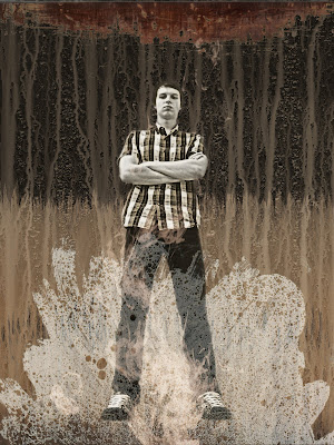
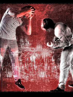
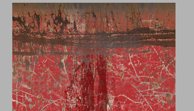
This is what I got after some playing around:

Here you can download the *.xcf file.

Nameless but cool effect

While playing aorund with The Gimp I stumbled upon a nice method to create an effect I personally like pretty much:


It is simple as hell once you got a grip at it. First create a black image with resolution of 800x600.
Now go to "Layer" -> "Scale Layer" And scale the background layer to 10% of its size:


Apply some noise to the scaled layer via: "Filters" -> "Noise" -> "HSV Noise" and choose the settings like something as follows:


We need to scale the layer back to its original size. Go to "Layer" -> "Scale Layer" and choose the following settings:

Here it is important not to use any interpolation since we want to maintain the pixels as squares.
All we need to do now is apply the sharpen filter with a very high amount like 80+<. Now you should have a result like the first image.
You can achieve different results by varying the noise and the scaling factor. so the size and the distribution of the squares can be modified like this.

Blurry reflection

Welcome to the first HOWTO on this blog. I will show you how to create a blurry reflection of an object on a dark background as it can be seen in the KDE4 splash screen:


Therefore we need any clipart to apply the effect to like the following Firefox icon:


Now let's get started and create a new image in Gimp with the following properties:


Now fill the background layer with pure black and open the icon or whatever you want as a new layer via "Ctrl + Alt + O":


Now create a guide by clicking on the top ruler and dragging the mouse about into the center of the picture. Align the bottom edge of the icon-layer on this guide with the Move-Tool that can be accessed via pressing "m":


Now we need to duplicate the layer by using the shortcut "Shift + Ctrl + D", flipping the layer vertically and aligning its top edge on our created guide. Be careful not to move the duplicated layer to the left or the right because then the reflection will not look realistic:


Select the flipped layer and apply the Gaussian Blur Filter: "Filters" -> "Blur" -> "Gaussian Blur" with the radius of 15px:


We are almost done. We need to add a layer mask to the flipped to let the reflection fade out to the bottom. Therefore we add a white layer mask as follows:

Layer masks are very useful. They contain a greyscale image where the brightnes of every pixel indicates the visibility of the pixel in the actual layer. So you can edit the transparency of a layer without touching the layer. Instead you can easily revert any changes to the layers transparency by editing the mask. Keep that in mind when you want to make something transparent. We will come back to this method in later tutorials.

The next step is to select the layer mask and add a vertical black to white gradient. To do this make sure that your two selected colors are black and white and select the gradient tool via "l". Now click at the very bottom of the blured layer and drag down to the top edge and make sure that the line you drag is exactly straight. Release the mouse and you will see the layer fade in one direction. If it is the wrong you will have to invert the colors of the layermask by clicking the following: "Colors" -> "Invert". Make shure that you still have the layer mask selected. If you want to change the hardness and position of the fade just use the following tool when having selected the layermask: "Colors" -> "Curves". Play around with this tool and you soon will find out what it does.

Last step is to apply a gradient to the background layer to simulate a slightly illuminated floor. Therefore we select a bit more than the half of the image starting at the bottom with the rectangular selection tool and then fill it with a gradient with a lowered opacity. Make sure that you have the background-layer selected and that the gradient again is perfectly vertical:


We are finished. Again you can use the Curves tool to modify the floor to your needs. The final result might look like this: