For this purpose you could create an image in that just serves as canvas for color picking.
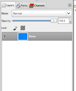
So lets start with some random base color. Open up an image(not to big 640x480 should do it) and fill the layer with your desired colour your layout shall be based upon:

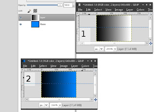
Next we add a new layer and fill it with a black/white gradient from left to right and set its mode to "Multiply". Create a horizontal guide to ease the creation of a straight gradient:

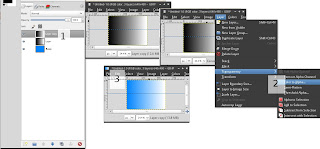
This way we already got the colours variations from normal to dark. Let's proceed with the normal to white variations. To get there we duplicate the layer containing the gradient, set its mode back to "Normal" and remove its black part via "Layer" -> "Transparency" -> "Color to Alpha" and the select pure black as the colour to be removed:

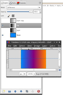
But we not only want variations of the colour but also of suplement colour. Therefore we duplicate the layer that has its mode set to "Multiply" and set it to "Difference":

This yields in three layers that can be combined freely to achieve many many matching colours when getting pickes with the color picker. Just ensure that you check "Sample merged" in the picker's tool-options.
This "rigg" could be extended by adding a gradient that slowly fades to grey from the base-colour as an example.
0 Comments:
Post a Comment